SETlib
Reducing worksheet preparation time by 81% by centralizing 17 years of course content
Overview
100,000+ files organized by date— but faculty think in topics. I redesigned how CS facilitators find and assemble course materials across two releases.
Facilitators at UW Tacoma spend 3–5 hours weekly pulling problems from 17 years of archived content — organized by quarter and week, not by concept. I owned the facilitator experience end-to-end across two releases. V1 was built around an unreliable parser, and V2 was redesigned after production revealed its limits.
Context
Facilitators spent hours per week hunting for problems.
Facilitators are undergraduate TAs with only six hours outside the classroom split between meetings and creating unique weekly worksheets. They spend their time pulling problems from Google Drives, organized chronologically by quarter and week.
But facilitators think in concepts: "I need a binary tree problem" or "I need something on recursion." The system's organization didn't match anyone's mental model, so finding the right problems meant browsing folders until something looked right.
The parser meant to automate content migration was unreliable, and that shaped every design decision.
This was the defining technical constraint. The other structural problem: facilitators and professors had no communication loop. No approval process and no shared visibility into what was being created.
Discovery
Every facilitator I interviewed had given up searching for content.
I interviewed 8 facilitators and 2 professors, focusing on where time was lost and what prevented them from finding the right problems.
Facilitators were abandoning searches because the time spent finding a problem exceeded the cost of rewriting one from scratch. This reframed the problem from "make search faster" to "make search usable."
I built a React prototype to understand where the parser breaks.
Engineering had shared that the parser struggled with complex formatting, but I needed concrete data to design effective failure states. Rather than wait for the full implementation, I built a functional frontend in React and connected it to the backend API to test the parser before committing to design decisions.
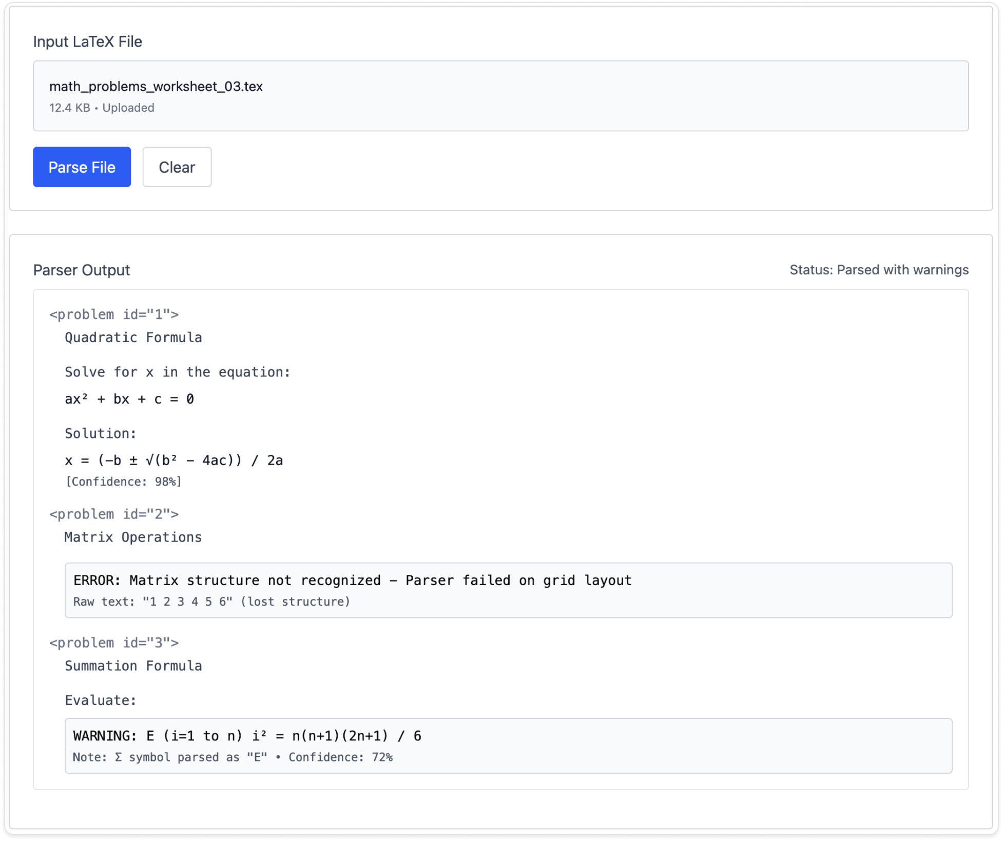
Basic LaTeX parsed reliably, but complex notation, math diagrams, and anything with embedded structure broke consistently. This told me failure states couldn't be edge cases but had to be the primary design consideration in V1.
Sharing the failure data with the team also gave us a shared understanding with engineering. Instead of abstract concerns about parser reliability, we had concrete examples of what broke and why.
V1: Designing for Failure
The parser failed unpredictably, so V1 was built to expose problems rather than hide them.
Every decision in V1 traces back to one question: when the system gets something wrong, how does the user know, and what can they do about it?
The facilitator-facing experience (search, assembly, review, dashboards) shipped as the MVP, while the parsing and content insertion tools ran as a separate internal interface. This let us deliver value to facilitators immediately while engineering continued developing the parser in parallel.
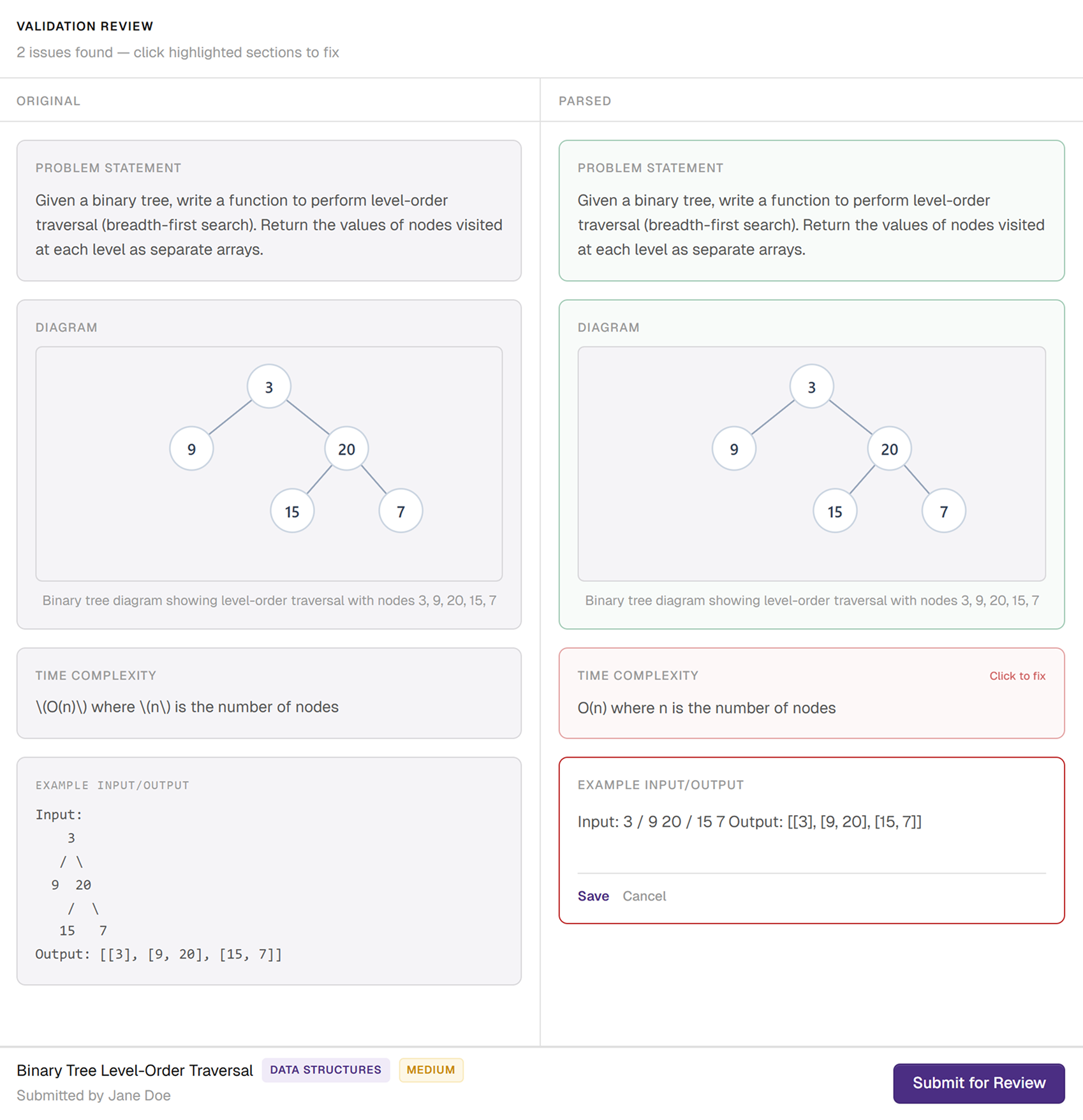
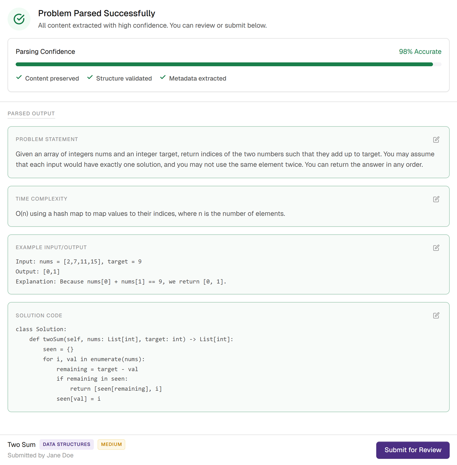
Side-by-side validation gave users full transparency into what the parser got right and wrong.
Every uploaded problem required manual review before it could enter the system. I designed a split-view that placed the original file next to the output so users could instantly spot where content was misinterpreted. Errors were flagged inline and manual correction tools let users fix issues directly.
This was a deliberate trade-off: mandatory review slowed down every upload, even successful ones. But with the parser failing this frequently, trust mattered more than speed.
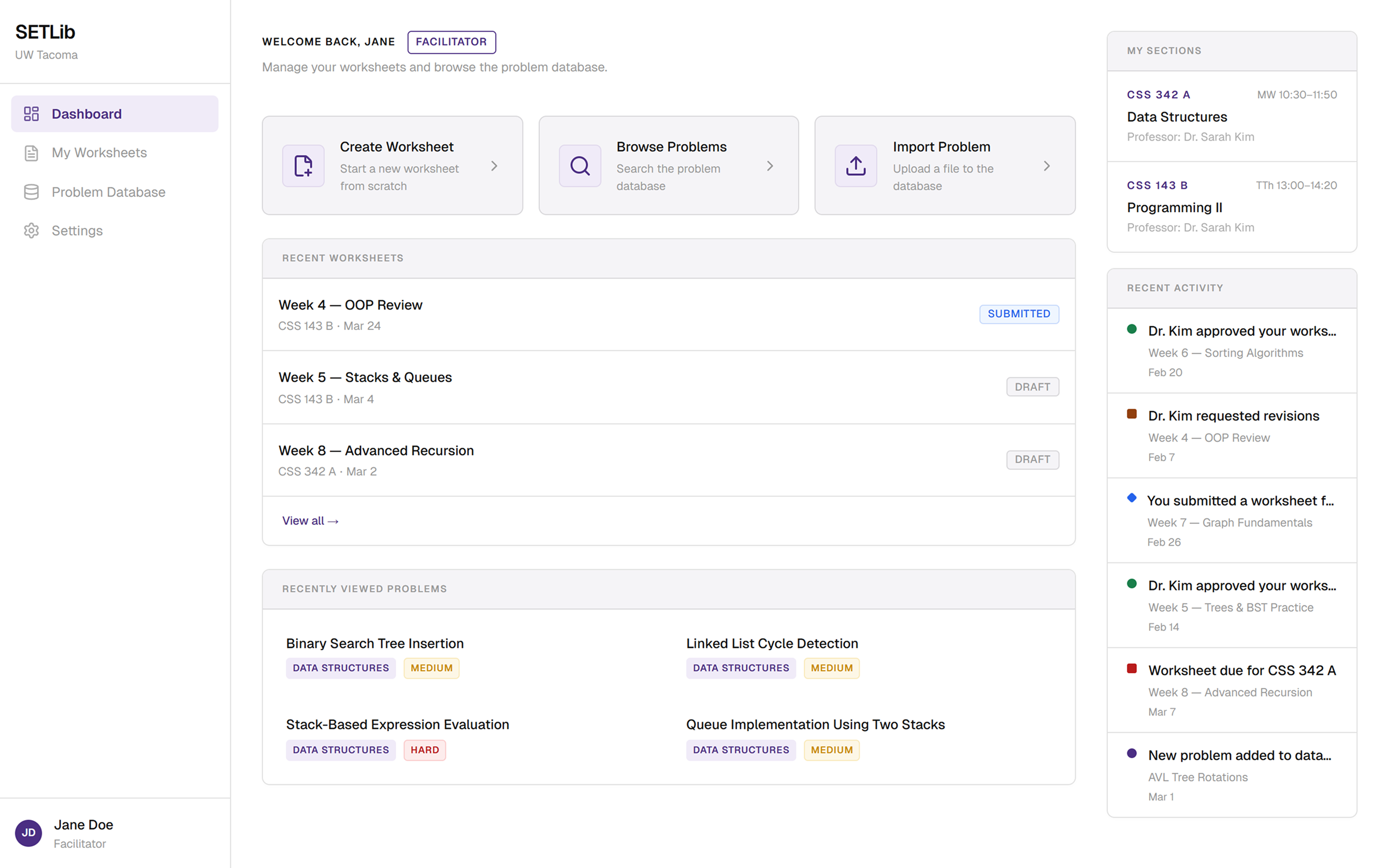
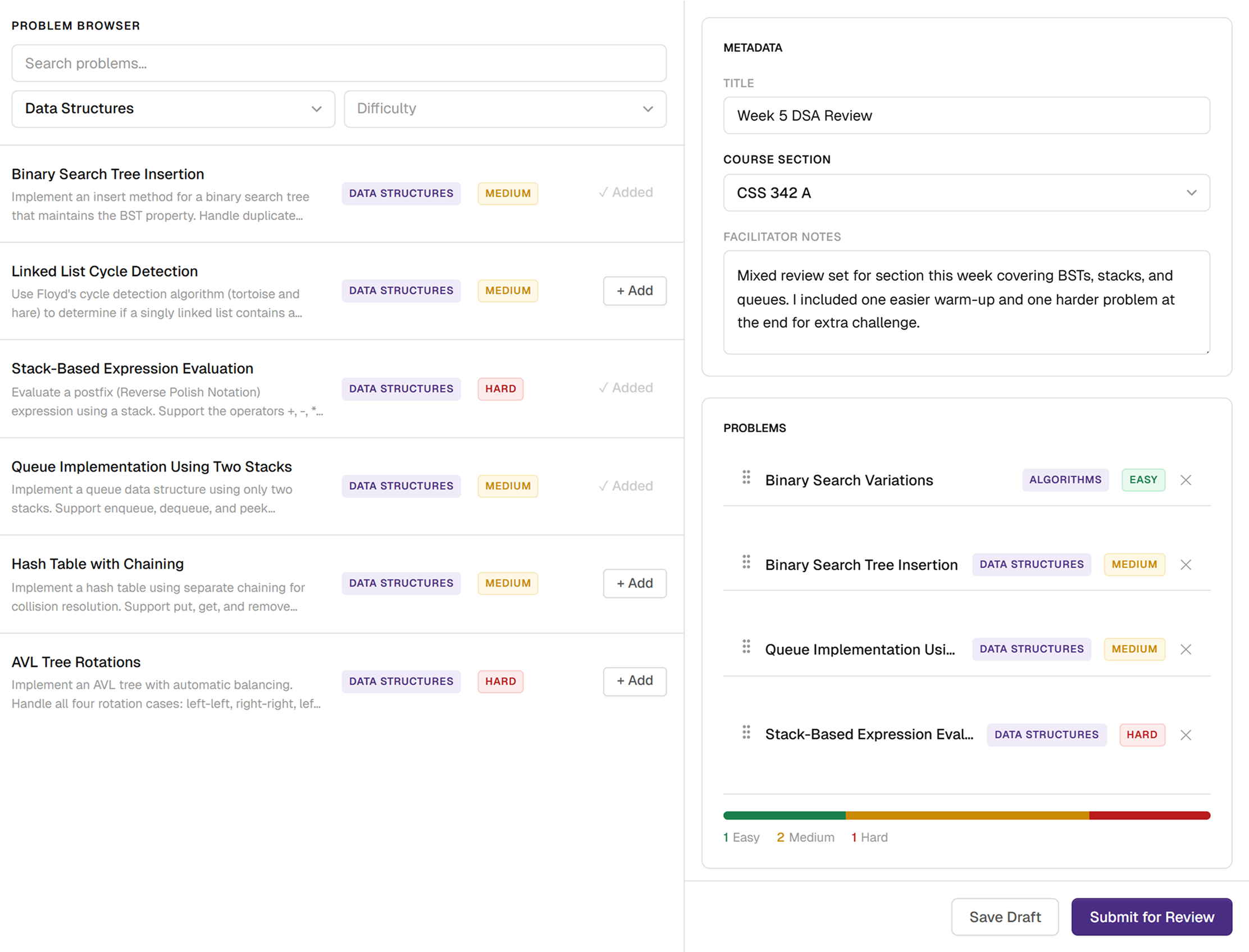
Search was reorganized around concepts using patterns facilitators already understood.
Instead of navigating folders labeled "Fall 2019, Week 7," facilitators could filter by concepts like Data Structures, Algorithms, or Recursion. I validated these categories against past curriculum and alongside professors to make sure the taxonomy matched real mental models.
Difficulty filtering (Easy, Medium, Hard) was inspired by LeetCode, a framework CS students already use to judge problem difficulty. The overall interaction followed an e-commerce pattern: browse, filter, and add to cart to keep the flow familiar and intuitive.

Assembly and review mirrored real facilitator behavior and closed the communication gap with professors.
Once problems were selected, facilitators moved into assembly where they could reorder and finalize their worksheet. I added a difficulty breakdown so they could check whether the worksheet felt balanced before sending it off. As well as a built-in place for facilitator-to-professor context that hadn’t existed before.
V1: Impact
Prep time dropped from 4.2 hours to 0.8 hours, but production exposed a critical limitation.
We validated V1 with 8 facilitators over 4 weeks using identical tasks. The results confirmed the core concept worked: an 81% reduction in prep time, with facilitators completing worksheets in a single sitting instead of spreading work across multiple days.
Facilitators told us prep finally felt predictable. Professors said seeing all pending submissions in one place removed years of back-and-forth. But once V1 went into production for fall quarter, we saw something our controlled tests hadn't revealed.
90% of parser failures traced back to embedded images, the most common content type in CS problems.
Our prototype used small, text-only samples. Production was different. Real CS problems are full of tree diagrams, graph visualizations, and annotated figures. The parser couldn't interpret any of them.
Mandatory review became the default experience rather than the safety net. Facilitators started bypassing it entirely. One faculty member simply asked: "Can I just insert problems manually?"
I brought production data to engineering and it directly shaped their priorities for the new parser.
V2: Designing for Confidence
A hybrid LLM parser changed what was possible, so I redesigned the workflow around trust instead of caution.
Engineering's new parser combined rule-based parsing with AI-driven interpretation. It handled PDFs, Word files, and mixed formats, interpreted embedded images, and surfaced specific diagnostics about what it struggled with and why.
This fundamentally changed the design problem. V1 asked "how do we help users recover from failure?" V2 asked "how do we help users know when they don't need help?"
I designed this framework — engineering built the API output around it.
When the parser is highly confident, the interface gets out of the user’s way.
The confidence score makes the system’s reliability visible, and the parsed content becomes the default view instead of a side-by-side comparison. Users can still edit inline if they want, but they’re no longer forced to validate content that doesn’t actually need correction.
The Trade-off
If a high-confidence score ever let a badly parsed problem through, users would stop trusting the system and revert to reviewing everything. I set the bar for "high confidence" high enough that users who skipped review would rarely encounter errors, even if that meant more uploads landed in the medium-confidence tier than necessary.
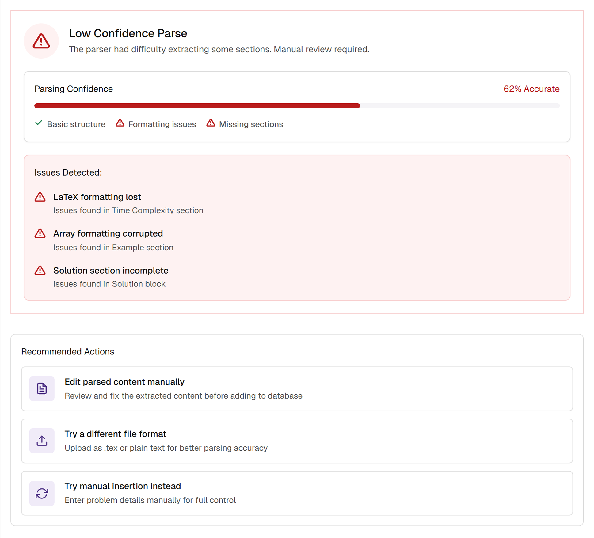
When the parser struggled, V2 showed exactly why and gave users clear paths forward.
Low-confidence parses surfaced a breakdown with plain-language explanations rather than generic error messages. Recommended actions gave users concrete next steps: edit directly, try a different file format, or switch to manual insertion.
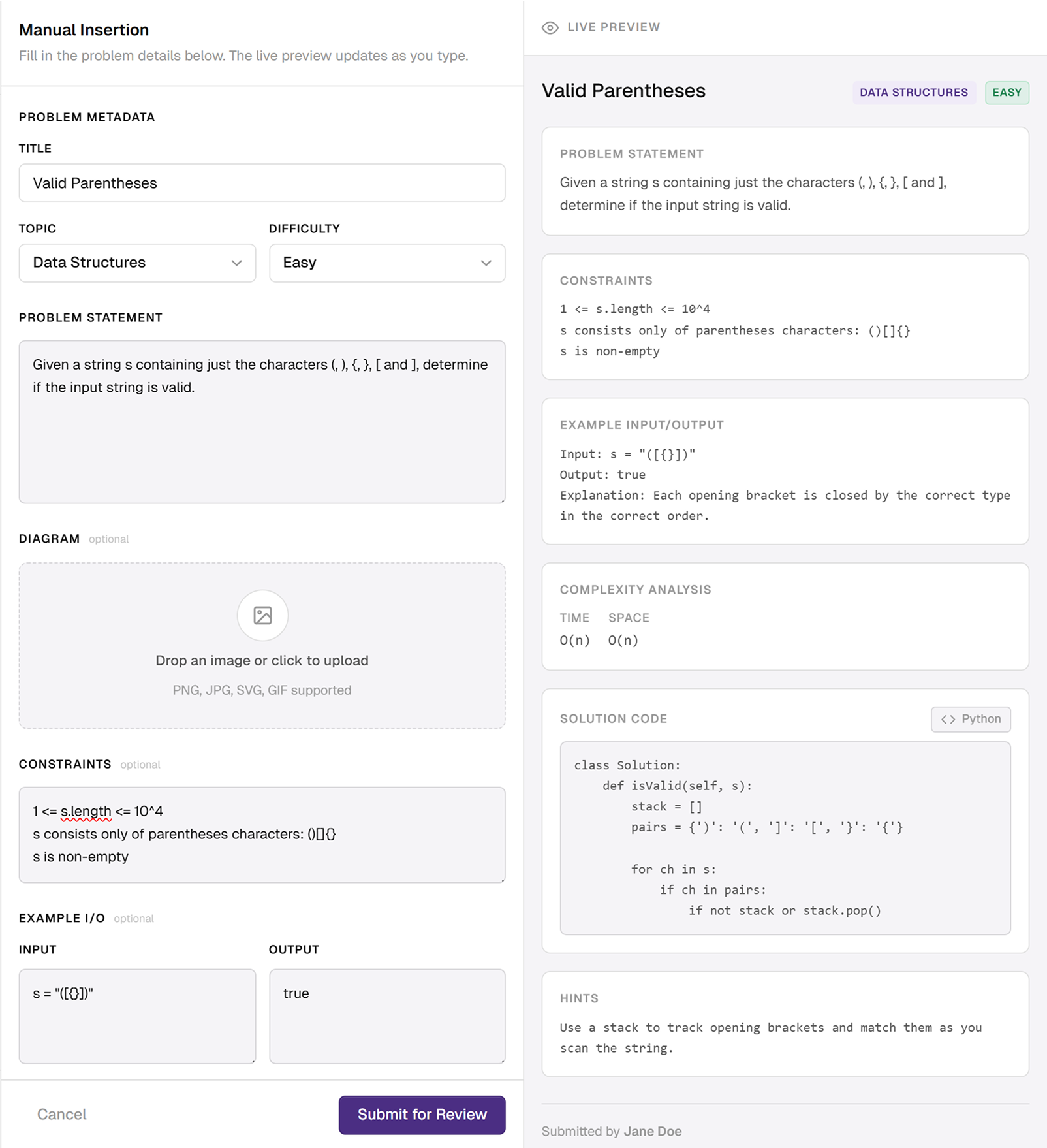
Manual insertion became a key workflow, not just a fallback.
This came from V1 feedback. I designed a complete manual entry flow: type problem content, attach images, set metadata, and see a live preview. Positioning this as a deliberate workflow rather than an emergency exit was important.
Outcome
V2 eliminated the friction that held V1 back.
V1 saw inconsistent usage during fall quarter because facilitators didn't trust the parser. After V2 shipped for winter quarter, professors mandated the switch. The system they once avoided became the one they enforced.
Reflection
When your backend is unreliable, transparency becomes the product.
V1 taught me that users will tolerate imperfect systems if they can see what's happening and fix what's wrong. V2 taught me the opposite: when the system becomes reliable, the fastest thing you can do is get out of the user's way. Trust isn't a feature you add. It's something you recalibrate every time the technology changes.
Getting close to engineering made me a better designer.
Building the React prototype, stress-testing the parser, and defining the confidence scoring framework all required understanding the system at a technical level. That proximity changed which questions I asked, which constraints I pushed back on, and which ones I designed around. The most impactful decisions came from understanding the backend well enough to know what was possible and what was worth advocating for.